Get field statistics with Statist/QGIS
по адресу http://gis-lab.info/qa/statist-eng.html
QGIS statistics plugin description.
The goal of Statist is to provide some basic statistics in text and graphical (frequency distribution histogram) form for the selected field of the vector layer. Both numeric (integer, real, date) and text (string) fields are supported. You can work with the whole layer or only with selected records.
Installation notes
You can get this plugin from official repository.
The plugin is designed for QGIS version 1.0 and higher. It also depends on matplotlib — Python 2D plotting library. If you want to use this plugin you need to install matplotlib first. If there is no matplotlib in your system, you'll see error message on QGIS startup.
For those who use OSGeo4W online installer obtaining and installing matplotlib very simple. Matplotlib package available through under Libraries. In other case you can download it from project home page (http://matplotlib.sourceforge.net) and install manually.
You can obtain sources from our SVN:
svn co http://svn.gis-lab.info/statist statist
How does it work
After the plugin installation and startup by clicking button
main window will appear:
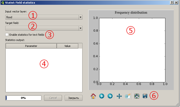
В окне присутстсвуют такие элементы:
- layer selection. Only vector layers are listed
- fields selection. By default only numeric fields listed there, but you can use checkbox 3 to switch to the text fields
- switch between numeric and text fields (this changes contents of 2)
- statistics output area
- histogram area
- navigation toolbar, see Navifation chapter
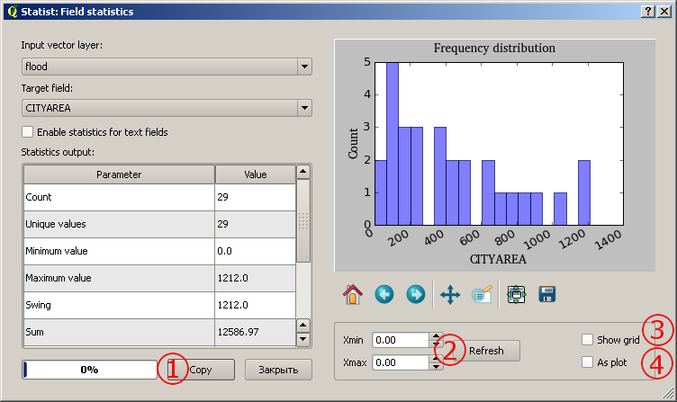
Statistics computation begins immediately after user selects a field from the list, the progress of this operation is showed with progressbar. After computation plugin window will look like this
Some controls change their state and some new controls appear:
- "Copy" button. Copy statistics output to clipboard
- fields "Xmin", "Xmax" and button "Refresh" allow you change limits of X axis, so you will have more detailed view of some interval. To do this enter appropriate values in the field and then press "Refresh" button
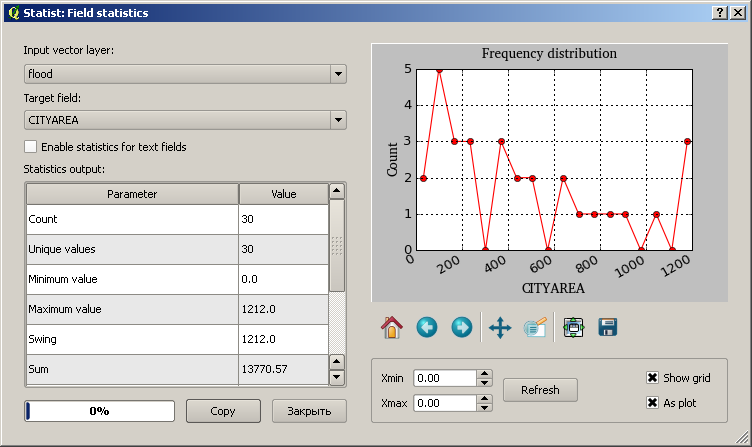
- show/hide plot grid (see screenshoot above)
- switch between bar histogram or linear plot representations of your data (see screenshot above)
Most of the above explanations are from the matplotlib manual (chapter 4 Interactive navigation).
Navigation toolbar is located below the plot area.
You can use it to navigate through the figure. Here is a description of each of these buttons.
Contacts
If you want report a bug, make suggestion or have a question about the plugin, contact the developer (more contacts). Also you can file ticket in bugtracker.


